
Readers
Hi friends;
This update is coming a few days later than we'd intended, but we've been waiting for something that we think is a little bit neat and we wanted to share.

Last week, we sent the most current version of our design files to iocolor and asked them to print several of what they call "readers". Readers are low-cost, quick-and-dirty print and bound copies of work in progress. The paper used feels slightly thicker than, say, that of a magazine page (so, thinner than we ultimately intend to print on). But the page is printed and trimmed to our currently-selected size, and all text is represented as it will ultimately be printed in terms of scale.
Readers are useful to us for a number of reasons. Primarily, they offer us a physical understanding of where we stand with our content. This reader is about 110 pages, and contains just over 40 recipes in various states of edit. We can hold this in our hands and understand how it feels to flip the pages, and we can conjecture how the book will feel when complete. We can say “Hey this is too big” or “hey this will probably be way too many pages” or “hey we can probably include more stuff here”, and can make decisions about our page thickness correspondingly (recall that page count and page thickness impacts the structural integrity of the book, so we can push and pull things around a little to land at a page count and page thickness that feels ultimately satisfying).
The reader is our first opportunity to understand our book in a very analog, physical sense. Up to this point, our book has been more or less completely virtual. We typically view our photos and design on computer monitors, which can be either desktop- or laptop-sized, neither of which really do a great job of conveying the tactile feel of the end product. Having a physical copy to flip through is an exhilarating benchmark of progress.
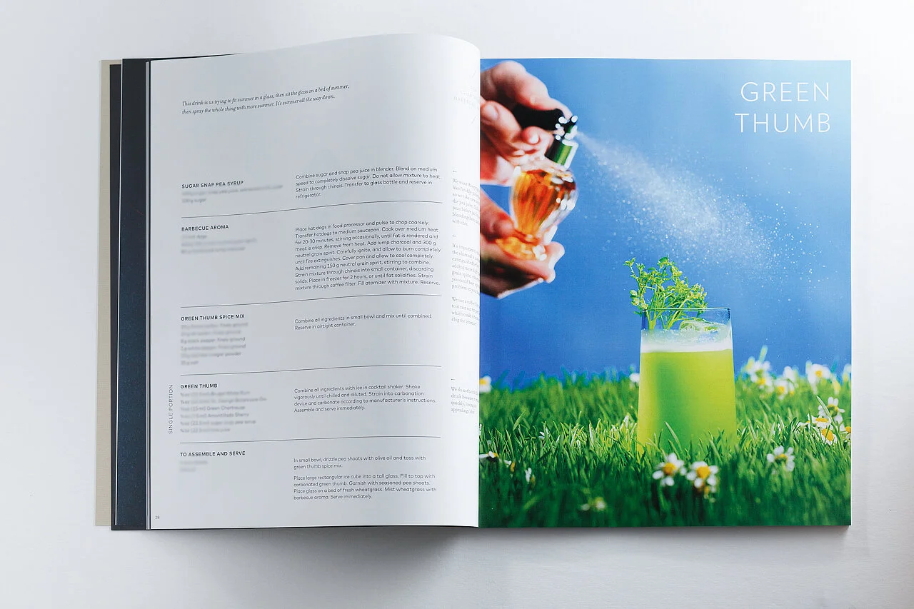

A good deal of our book is still a work in progress; Sarah drops proxy photos or shapes onto pages to either sketch out design ideas or flag potential photos for me to shoot.


Several of the spreads in the reader are effectively prototypes. While we’re still honing our “cluster” section for In The Rocks, Micah and Ingi have delivered several other clusters for which we’re planning design. Here, for example, Sarah sketches approaches to the Porthole, using photography from the Alinea Group’s massive media archive. Once we’ve established some clarity in our ideas, we’ll shoot new photographs specific to each spread and recipe.

A second function of the reader: we’ve enlisted the help of one of the bar chefs here to take one of our readers and make every recipe as we’ve written it. This is a verification mechanism to ensure we’ve properly documented everything, that there are no omissions of information, steps, or ingredients, and to see if there are opportunities to augment the recipes with any further information that Sarah and I simply don’t know to ask about. Despite combing through the recipes as carefully as we can and re-verifying them with the head chefs after writing them, we’re still aware of potential mistakes that can fall through the cracks as a result of “screen fatigue”.
(A long parenthetical aside: Sarah and I pull our ideas for presenting the same information in multiple ways from a habit we’ve both picked up from our time as visual effects artists. VFX artists frequently flip or rotate the images on which we’re working to gain fresh perspective on them, to avoid overworking areas that don’t deserve the honor or to spot mistakes we’ve become blind to. Any painters reading this will likely echo this habit with their canvases . Looking at things from a different perspective often provides new information, which can help creative decision-making.)
Anyway, back to the reader. On the technical side of things: the range of colors a given printer can produce is referred to as the printer’s “gamut”. A low-cost consumer-grade printer that uses only a few separate ink cartridges is only able to produce a limited range of colors. Use of more, specifically-chosen cartridges can address the ‘dead spots’ in this range, and can therefore reproduce more subtle shades of color. The gamut of the printer used to produce our readers is fairly limited, and so the dynamic color range of images in the readers does not represent the full potential of our images. iocolor was kind enough to produce a handful of wide-gamut test proofs, which are individual print tests of a subset of our pages printed on a printer with a much wider range of colors it can reproduce. We can see below that this wider gamut yields images with a fuller, more luminous quality that more-closely represents what the images will look like in our finished book (on the left we see the reader; on the right, a wide-gamut proof). The entire book will undergo a fairly rigorous color scrutiny later on down the road, but seeing spot tests like this is helpful for us to understand what kinds of problems are inherent to particular photo scenarios (flames are hard, we’ve learned, e.g.).

The pages of our reader are assembled together (“bound”) using a technique called “perfect binding”. Perfect binding is a process whereby printed pages are stacked and a thick bead of glue is applied to the spine to hold everything together. The pages are then neatly trimmed at their edges:

Perfect binding is an economical and tidy way to join pages for this purpose. The downside with this approach, however, is that it doesn’t allow pages to lay flat when the book is fully opened. If the pages are forced flat, the glue risks cracking.

Over time, repeated opening/closing the book – combined with aging of the spine glue – causes the glue to crack. Pages eventually come loose and fall out as a result. If you’ve ever picked up well-worn older paperbacks (which are typically perfect-bound) and noticed loose pages, this is the cause.
(Another long parenthetical aside: perfect binding is typically the mechanism used by print-on-demand services like Blurb and the like. While the short-term color fidelity of a book produced by these services can seem vivid and appealing, it’s the wrong measure of quality to apply to books produced in this way. The inherent limitations of this style of binding make books produced in this way not suitable for archival purposes.)
A higher-quality alternative to perfect binding is what’s know as Smyth sewing. In this case, clusters (“signatures”, recalling an earlier update) are gathered and sewn together, then all sewn signatures are fastened to a flexible stitched spine. This style of binding is more suitable to higher-quality books intended for archival, or books with large pages that need to lay pleasingly-flat on a surface.

Other things we’ve been working on in recent weeks include writing about and photographing drinks from The Office, and interviewing several staffmembers for the purposes of drawing information that we may use for designing and structuring this section of the book. Our recipe count has climbed to above 65 so far, again in various states of edit (our goal is 100). With so much information in play, we grow increasingly careful about ensuring accuracy and consistency; there is a lot of circling back to adjust previous recipes that we thought were locked as we continue to unearth new information.
From a personal standpoint, a thing I’ve found fascinating (and a point of personal leveling-up) is letting go of a sense of pedantry. Coming from a very technical, engineering background, it’s comfortable and natural for me to say “Ok, if we’re doing this here, we need to do it like this everywhere”. (And, in fact, I place a false confidence in myself when reading recipes that imply this kind of rigorous, lab-like precision, because it eliminates a need for subjectivity, which would otherwise put me on less sure-footing about my abilities in a new and unfamiliar matter. Sort of like buying a really nice digital camera and hoping its technology will do the work of making a person into a better photographer.)
But I’ve found repeatedly that the insistence on pedagogery often doesn’t quite make sense. Sous vide temperatures, for example, are often listed like “75°C (165°F)”. When I was given recipes involving dehydrators by the chefs, however, temperatures were consistently expressed in Fahrenheit only. I asked about this, and the chefs shrugged: “our dehydrators don’t have Celsius markers on them”.
It is in moments like this that I realize the “kitchen as lab” aesthetic that is so fiercely fashionable is often projected unfairly on restaurants, and while the engineer side of me wants to shake my fist in the air and mumble “Why, they oughta FIX this and make it all consistent!”, the truth is that this is not a laboratory. This is a collective of artists finding new and interesting ways to appropriate tools that were not designed with them in mind to explore new ideas. Innovation, then, is messy. This puts me in the peculiar position of both wanting to be meticulously precise and understanding that doing so is not fully authentic. How to strike the right balance?
The only real choice is to continue to explore.