
Photography: Pt. I - Context
Hi friends;
I’d like to talk a bit about the photography of this book. I feel there is too much to say about this to fit it into one (overwhelmingly-long) update. So, much as Sarah did when she talked about design, I plan to share multiple updates throughout the course of this week.
We’ve been pushing aggressively on our photography schedule since Christmas, and are near the 85% completion mark (we think) for photos. I’ve been reticent to write about this subject so far because, honestly, I’ve been learning as I go and didn’t have a ton of confidence that I could share anything interesting until now. I’ve mentioned before that I came into this project having zero experience photographing cocktails. Discovering how it differs from photographing food, learning and developing new strategies to address these differences, and getting to a point on the learning curve where I’m adept enough to make creative decisions rather than just technical ones has taken some time.
Nick wrote extensively about why we are choosing to self-publish this book, but I’d like to belabor one of his points a bit. Printing a book is a physical process; unlike the digital realm, where the use of color doesn’t really affect the “cost” of a web page, laying ink onto a piece of paper involves cost considerations. Black text on a white page literally requires less ink than a photo (which requires a minimum of 4 colors to represent…we’ll get into the technical ins and outs of printing in a later update). All of this is to say: printing photos in books is expensive.
Publishers often seek to mitigate these costs by minimizing the inclusion of photos. When it comes to cookbooks, the ramification of this, as Nick points out, is that a home chef is far less likely to try cooking a dish for which no photograph is provided. Unless the reader already has a familiarity with the flavors or visual character of such a dish, they are unlikely to try making it.
This problem is even more exacerbated in the world of cocktail books. It’s tempting for some publishers to dismiss cocktails as “just liquid in a glass”. The supposition is that cocktails are typically visually boring, so why take up precious page real estate with costly inks to show a glass holding brown liquid? There also seems to be a (perhaps historical?) precedent for the form factor of a cocktail book. They’re generally small, designed to be tucked behind the bar and used more as a reference manual, which supports the apparent lack of need for photographs (why include photos if you’re gonna be looking at this in a dim bar?)
All of this leads to the landscape of cocktail books available today: small, few photos, with kind of a “handbook” vibe. To be sure, there are exceptions to this, but a browse through the “Cocktails” section of a local bookstore shows they are rare.
The Aviary’s drinks are, by design, visually-arresting. The chefs here often seek to provoke some sort of emotional response and want to involve as many senses in this effort as they can. The presentations and flavors are also likely to be unfamiliar. Both of these factors strongly suggest that photography of each drink (and, in cases, the process of making it) could be helpful.
So, from the beginning, this has been an agreed-upon mandate we’ve imposed on this project: there will be photos of everything.
To understand how I’ve approached learning this aspect of things, I feel it might be useful to start here:

This is the first photo I ever took of food. I know…magnificent. But for the sake of discussion, let’s pick this apart a little bit. What’s the story I’m trying to tell here? It’s clear that I seem to have grilled some vegetables and meat, and it’s clear there’s some sort of glaze dripping off the skewers. But it’s not entirely obvious what the flavors in the glaze might be. To add clarity, I included some extra information: the ingredients I used to make the glaze. I then took a photo of everything from what appears to be the position I was sitting just before eating the skewers.
To see why I think this observation can be useful, let’s consider some other images that I did not take:


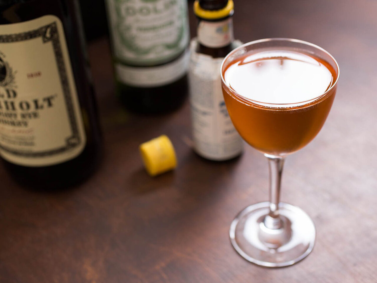
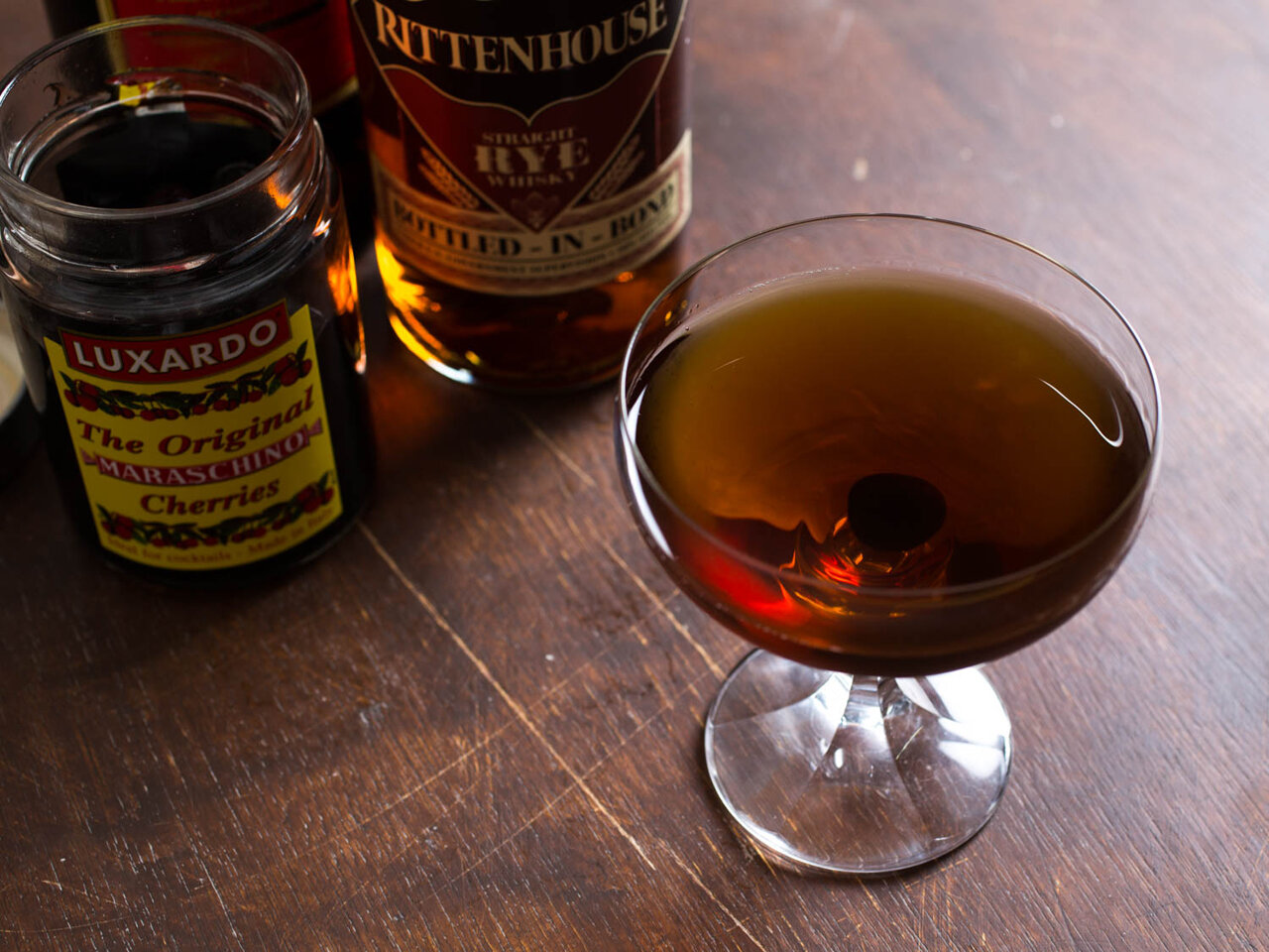
When I began looking around for examples of cocktail photography, some patterns began to emerge. I noticed one of these patterns was shared in my skewers image: a desire to add information. Taken alone, these cocktails convey little information about what they might taste like. The inclusion of constituent ingredients helps add clarity (and also some extra visual interest).
There’s an interesting problem with this approach, however: if you don’t know what, say, Tiger Sauce or Campari or Red Vermouth tastes like, the extra information isn’t actually helpful.
In making this book, we realize that investing in cocktail ingredients can be expensive. And we want a reader to be able to hunt through our recipes and have an understanding of the flavors, so they can decide whether they might like to try making the drink. But I find the inclusion of bottles and such in photos of Aviary drinks distracting; as I said, the drinks themselves are designed to be visually-appealing, and we don’t want to detract from that. So to address this, Sarah came up with the idea to present this information in a design element that we include on every recipe:


Offloading this information in this way accomplishes a few things: it offers information we hope is helpful, and it pushes me to be more creative by taking away the need for a compositional strategy I might have been tempted to use otherwise.
Let’s consider some more examples:


Another pattern that emerges to me when I flip through cocktail books is the use of the same composition seen in my skewer photo above: the cocktail is photographed from a perspective that one might normally view a cocktail (which is to say: sitting near it, looking down at it). This, to me, is a very comfortable composition: it’s familiar and it conveys scale well. It’s so comfortable, however, that it can lack a bit of surprise or impact.
We can see how a bit of extra drama can be added by using a wider-angle or macro lens, which allows the camera to be positioned closer to the drink. This throws the table and background more out-of focus, and tends to make the photo feel less like a snapshot and more like a formal portrait of the cocktail:

Addressing the issue of adding extra visual interest to an otherwise spartan photo of a cocktail seems to give rise to a handful of recurring strategies. I notice in food photography that adding a human element can often add interest (e.g. hands manipulating utensils or serviceware). This image, for example, was one I took in my early days of working through the Alinea cookbook:

Sarah’s hands were in the photo by necessity: I needed her to hold the bowl because the bottom is rounded, making it impossible to sit on a tabletop (this is by design; the dish is meant to be held by the guest as it’s eaten). But I was surprised at how much I liked the extra warmth and interest her hands added to the image.
I notice cocktail book photographers sometimes reach for this same trick. When the involvement of hands feels natural or functional, this can add some nice extra interest to a photo. In other cases – when there’s no apparent necessity – the image ends up feeling less natural to me.


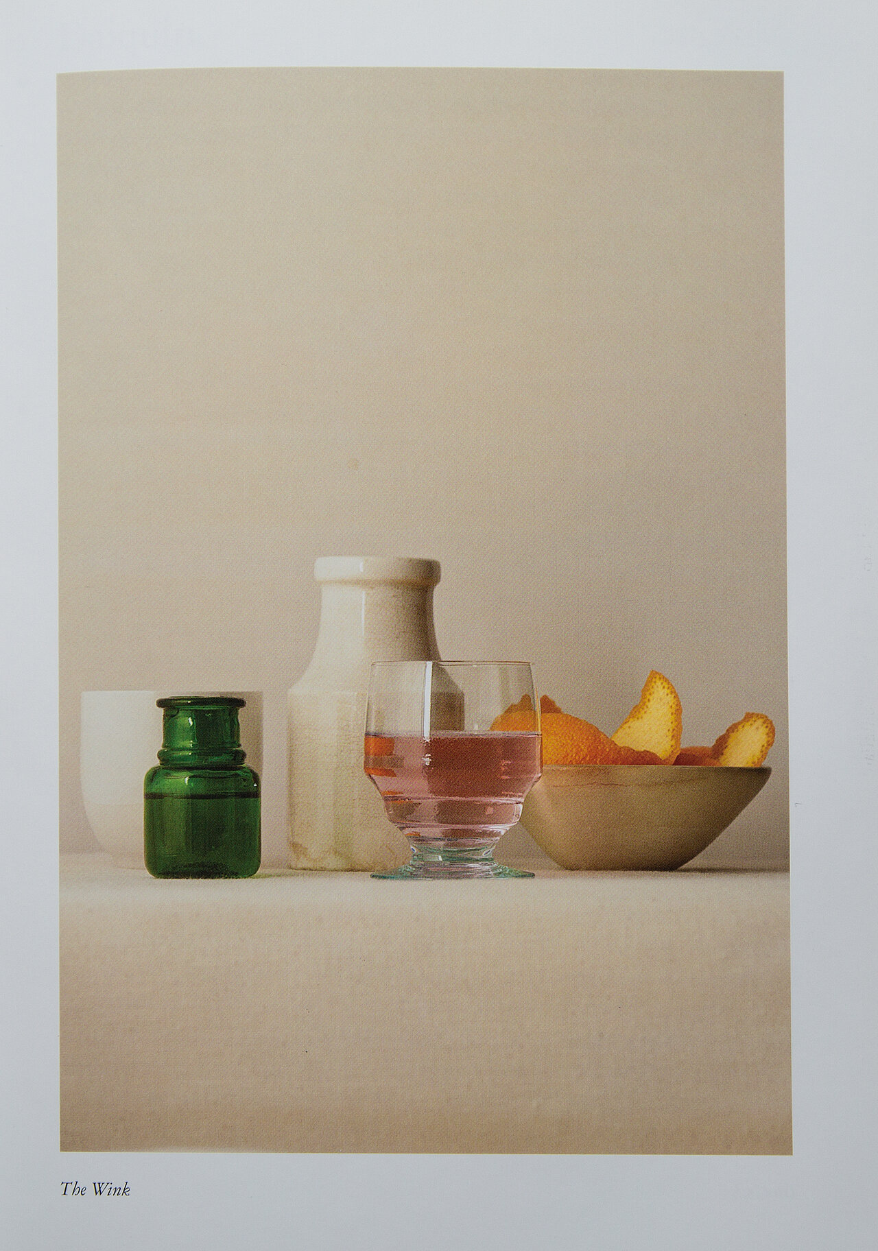
Another strategy I notice is the creation of a still life or diorama to give a vibe or feel to an otherwise visually-bland drink. These, to me, can range from subtle and interesting to totally perplexing:


By far the most common aesthetic I see in the majority of existing cocktail photography, however, is this sort of vintage, stylized Prohibition-era vibe that suggests cocktails are somehow “antiques”. I think I get it: there’s a very deep, fascinating history to this particular culinary subject, and this antique feel is romantic, charming, and beautiful. But to me it also implies that the very concept of the cocktail is somehow cemented in this rose-colored past and hasn’t changed since.
And, obviously, this is pretty much the exact opposite of the general approach Chef Achatz takes to anything here.
In studying this, I’ve also found a handful of sources of inspiration. My favorite cocktail book from a design and photography perspective is “The Cocktail Lab“. Here’s an example: the book is unafraid to let this drink speak for itself, with no extra adornment:

I love this photo. I love the subtle coloring and the graphic reflections from the lighting environment, and I love that it’s composed the way you might shoot a portrait of someone.
Other examples from the book feature tastefully-subtle and apropos environments or backgrounds, which help offer a vibe for the drink without being obnoxious:

Even in the cases of “still life” approaches, I generally find the extra set garnishes interesting – more modern than antique – which is refreshing to me:

Ultimately all of this study is meant to help me calibrate my standards for this book and formulate an aesthetic game plan. I’d very much like to push myself and the content of this book creatively, to help serve the subject matter itself and to ensure each of you ends up with a book you feel is unique and interesting. We’ll dig a bit more into what that means in the coming days.
Cheers;
–a