
Visual Effects: Pt. II
Hi friends;
Before we launched this Kickstarter, Chef Micah and I had a “practice run” photography session. The exercise was meant to get me thinking about how we might want to handle the photography of different kinds of drinks. Micah chose a range of drinks to test, including Meet Me In Tennessee, which he worried could look boring when photographed:

Because the drink had been presented to me in this way (“This one’s pretty boring, let’s see how we can make it look more interesting”), I’d already been primed to try some unusual lighting. Then, to add more visual interest, I generated some weird CG flourishes and composited them in:

Another drink that presented me with something to think about was Bring Another Smurf. This incredible drink is actually two cocktails in one glass, separated by a disc of ice. Upon being presented with the drink, a guest is invited to blow into a straw protruding from the glass. This disrupts the ice raft, turning it into a paddle that stirs the drink, which in turn triggers an interesting color change. For our test shoot, we affixed a tube attached to an aquarium pump to the straw to blow bubbles into the drink:

Looking at the photos, I realized that any single one of them sort of failed to properly capture the experience of seeing this color change. We could obviously present a spread of multiple images, but that felt a bit predictable. And in any case I was on this jag to think critically about how vfx could be used as a tool, so I started wondering about the idea of using computer graphics to try collapsing a span of time into a single photograph. I set up a fluid simulation of two liquids and wrote a small bit of code to diffuse their colors together over time. I then rendered out a few frames of this fluid simulation, and composited these into a single photograph of the Smurf.


After finishing these tests, I took a step back to consider them both.
To me, the Tennessee experiment wasn’t particularly successful. Sure, the weird little light curves do indeed add some extra visual interest…but to what end? Including some random computer-generated element that calls a lot of attention to itself for no apparent reason would be, I think, a clumsy application of this technology. It’s not really different than Chef Achatz’ general disdain for garnishes which serve no purpose on a plate, in fact.
The Smurf test, however, is much more interesting to me. It makes me wonder: can I selectively employ computer graphics in a way that supports the “story” of this cocktail? Does doing so provide more information in an effective or interesting way? Does it add anything, or is it just functionless digital garnish?
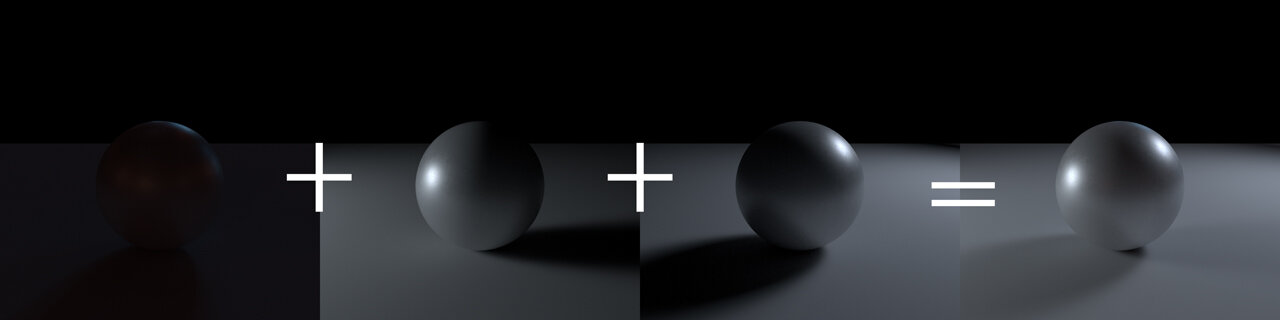
Even if I’m not directly augmenting an image with computer-generated elements, I find opportunity to leverage techniques I learned working as an artist in VFX studios. Let’s consider one example. Here’s a simple image of a computer-generated sphere:

We can see the sphere is illuminated by a single, blue-colored light coming from screen right
Here’s the same sphere lit by another light, this time a warm-colored light coming from screen left:

And finally, here’s the same sphere lit by some ambient light data I collected from The Office in NYC:

(This ambient light data looks sort of like a panorama):

A bit of physics knowledge teaches us that light has the peculiar property of being “additive”. This is a fancy way of simply saying that if you have two lights, and you shine them onto a surface, you end up casting “Light 1” + “Light 2” amount of light onto the surface. We can see this visually here:

In the image above, we can see my ambient-lit sphere, my left-lit sphere, and my right-lit sphere. If we add each corresponding pixel in each of the first three images, we end up with the result on the right.
Now, imagine you’re an artist showing a director the above, rightmost image. It’s possible the director might say, “I love this, except I wish the light coming from screen right was less blue”. It would normally be pretty tricky to isolate the contribution of the blue light alone in the rightmost image. But, because we actually have each light split out separately, we can do a neat trick where we can adjust just one of the images, re-add them up, and change our result:
In the above image, I’ve re-colored the screen-left and screen-right lights to be more neutral in color, and re-added everything up, resulting in a more neutral overall image.
I can even do interesting things where I adjust the intensity of the lights independently, as if they were each on a dimmer switch:
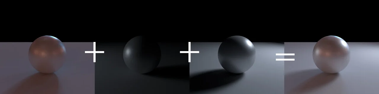
Here, I’ve boosted the intensity of my ambient light, and lowered the intensity of my screen-left light, which yields the result we see here.
Working this way allows a vfx artist to respond quickly to a director’s comments without having to re-do a lot of extra work.
When photographing cocktails in The Office, I knew I wanted to include the Office environment itself in my photos. The lighting in the office consists of lots of differently-colored lights: the bar itself is sort of purple, and is tinted by all the bottles sitting on it. The ceiling lights are all a very yellow tungsten color. And my flashes are “daylight-balanced”, which means they’re more blue-white in color. I suppose a “for realsies” photographer would know how to use colored gel filters to tint the color of each of these light sources to bring them all into balance. But, instead, my instinct has been to try using the above light-splitting idea when shooting in situations like this. Here’s an example of a very, very old bottle of bourbon, lit from above:

Here’s the same bottle, now light from screen-right:

And again from screen-left:

I can add these images similarly:
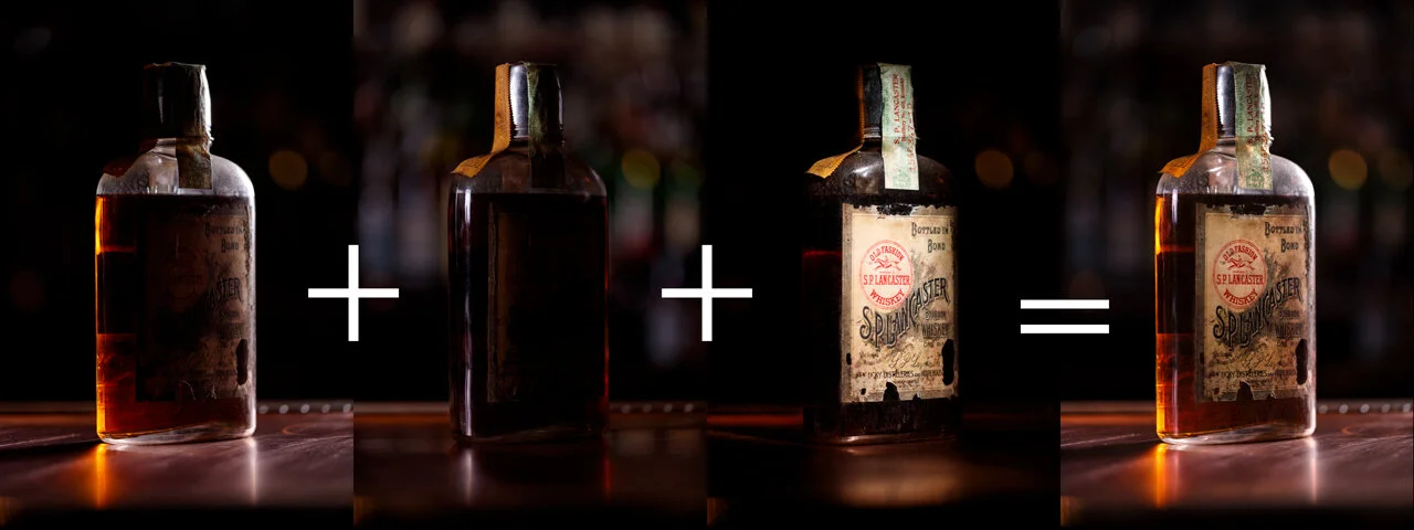
The above example is a relatively simple one, but other photos are a bit more complex:


Working this way has bought me a lot of flexibility: I don’t have to ask for reshoots nearly as often, and I can effectively change my lighting after the fact. This latter bit is useful if we find that this image might need to be placed on the left page in a spread vs. the right (which might encourage me to ‘relight’ it a bit to make the whole spread feel more balanced).
Another example of leveraging computer graphics: Sarah and I talked a bit about designing a bird flock motif to use as a design element throughout the book. Rather than hand-illustrating several flocks of birds, I offered to help Sarah with this work. I started with a simulation of particles:

Then I created an animated cycle of a bird flapping its wings:

I can then “stick” a copy of this flapping bird onto each particle. I can offset the animation forward or backward in time (so that the birds aren’t all flapping in unison).

Sarah then chooses a frame or two she likes, and we render them out for her to use in her design.

There are lots of other places Sarah and I are finding ways to use our collective vfx knowledge (Sarah also has an extensive career in the industry) to apply towards this book. The above examples are meant to highlight how we’re approaching this, attempting to apply our skills in ways that enhance rather than detract from things. We’re hoping the final result feels harmonious, balanced, and well-integrated.
Until next time;
–a