
Printing 101
Hello friends;
This past month has been – as we anticipated – quite busy and challenging. We’ve begun the prepress process with our printer, iocolor, in earnest, which has involved some finicky details which we intend to cover in depth in this and the next few updates.
To understand what “the prepress process” means, let’s build ourselves some foundational understanding of the printing process as a whole, starting with the idea of a prism.

You’re probably familiar with the underlying principle of a prism, a triangular shape that can split white light into its constituent colors. Light itself exemplifies what’s called an additive color model; colors are added together to yield white. We saw this principle demonstrated a few posts ago when discussing visual effects. The primary colors in an additive color model are red, green, and blue. These three colors can be mixed together in varying proportions to yield many other colors.

Computer monitors embody a real-world example of this additive color model: computer monitors work by projecting light onto a screen. A given pixel on a computer monitor starts off “black” (i.e. “no color”). To make a pixel “white”, a monitor combines red, green, and blue light. Digital photography works on the same principle; the pixels in a digital photograph all consist of varying levels of red, green, and blue to yield a final image.
A printed image, however, works differently. When we print an image, we start with white paper. Producing color on the paper involves depositing pigments onto the paper. Light has to travel through this pigment to hit the paper; when this light reflects back to our eyes, part of its color has been absorbed (subtracted) by the pigment. Printing, then, is an example of a subtractive color model.
A subtractive color model is probably what most of us learned about back in our earliest days of school. We learned that red, yellow and blue were the primary colors, and that if we mixed these in various proportions, we could produce other colors from them with our finger paints.

Our desire when printing, then, is to take an image represented by an additive color model and convert it to something that works in a subtractive color model. How is this done? Let’s press further into color theory:
The complementary color of red is cyan, which means that cyan pigment serves as a filter that absorbs red. The amount of cyan applied to a white sheet of paper controls how much of the red in white light will be reflected back from the paper. Likewise, magenta is the complement of green, and yellow the complement of blue. By setting cyan, magenta, and yellow as our primary subtractive colors, we’re effectively letting light’s primary additive colors of red, green, and blue reflect off a piece of paper back to our eyes. This model works nicely to effectively “invert” the additive color model computer monitors exhibit.
This seems great; we’ve learned that we can combine cyan, magenta, and yellow pigments in varying amounts to produce more or less any color we want on paper. If we were painters, we could start with a palette of these primary colors, and could dab around with our brushes to combine these pigments to create just the right color we wanted before applying it to our canvas. But pre-mixing each and every color we want to appear on a page is time-consuming; if we want to print 30,000 copies of a 468-page book and get it to you as soon as possible, pre-mixing every single color you’d see would be completely unreasonable.
So, printers use a clever technique to make this process more efficient: they separate an image into its cyan, magenta, and yellow primary components. To help explain this more clearly, let’s introduce some more visuals.
Consider this idyllic barn set against a backdrop of the Tetons, an image which I’m sure will make you feel peaceful and relaxed.

For each color seen in the image above, we can ask “How much cyan is in this color? How much yellow? And how much magenta?” We can separate each of these subtractive primary colors like this:

Mixing full amounts of each of these three primaries in an attempt to create black doesn’t quite all the way work; what one ends up with is more sort of a muddy brown color. It’s also highly inefficient: imagine printing a book full of black text using three different inks. It would be expensive, and there would also be all sorts of registration problems getting the three inks aligned exactly right for small text.
To remedy this, printers add black pigment as a fourth “primary” color. Here’s the same barn image, now split into cyan, magenta, yellow, and black components. Note how it makes much more efficient use of the colored inks.

These four colors together comprise the CMYK color space.
So, we have our four primary colors, which mix in varying amounts to yield many other colors. How is this mixing accomplished? Offset printers leverage a technique called “halftone screening” to determine how much of a given color pigment is applied to paper. Halftoning is an optical illusion that seeks to represent continuous tones using dots. Viewed from a sufficient distance, these dots appear to meld together to form continuous gradients of color. The “amount of color” in a halftone is controlled (in most cases) by varying the size of the halftone dot: larger dots = more color, smaller dots = less color.

The relative density of these dot patterns are measured as “dots per inch”, or “DPI”. Generally speaking, the more dots per inch, the finer the achievable resolution of an image.
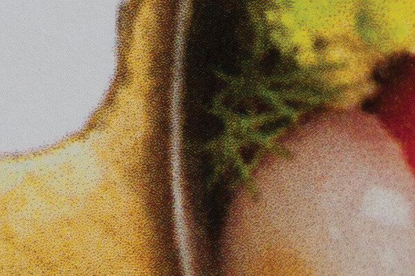
Here’s a closeup of an image of my niece, printed using Blurb’s print-on-demand service.

Note the ‘spotty’ quality of the image; this isn’t an artifact of my camera. It’s the halftone screening process used, and is a combination of several layers of halftones. Each layer is made using one of our primary subtractive colors: cyan, magenta, yellow, or black. I can separate out each of these layers like this, and we can clearly see the halftone patterns:


You might notice that the ‘grids’ of dots all seem to be oriented slightly differently. This is a technique that aims to obfuscate the halftone optical illusion and make the dot pattern less obvious.

Below is a closeup of one of my favorite cookbooks. Note that we can again see the halftone pattern at work here. Sometimes the various degrees of rotation of each of the halftone screens produce secondary, circular artifacts called “rosettes”. Note also here how the dots are more densely-packed. As a result, the image is a bit more crisp, and finer details are able to be resolved.

Let’s compare these images with one made on a photographic inkjet printer. Inkjet printing works a little differently than halftone screening; instead of a fixed grid, dots are randomly scattered by a nozzle in an inkjet printer. We can see the dots in the image below are smaller, and much more densely-packed. The overall print quality is higher than that of the typical grid-arranged halftone dots used above. The downside with inkjet printing, however, is that it’s slow and almost prohibitively-expensive to produce a book using this technique.

Let’s now consider this closeup, which is from one of the Modernist Cuisine cookbooks. Rather than modulating the size of the dots (“amplitude modulation”, or AM screening) in the halftone screen, these books were printed using a technique called “Stochastic screening”, or “frequency modulation” (FM) screening. Rather than adjusting the size of the dots, the color gradations in this image were made by adjusting the frequency of the dots. The dots themselves are the smallest and most densely-packed in all of these examples, offering crisp, sharp edges and no rosette artifacts. As a result, the images produced by stochastic screening have a great amount of fidelity and sharpness.
It is this stochastic screening technique that we will be using for our book. Having established that and finalized all our content, our attention now turns to making sure that the images that we see on our screens here in Chicago exactly match those that will come off the printing presses in China. We’ll discuss how this color pipeline works in our next update.
Until then;
–a