
Color & Proofing
Hello friends;
In continuing our discussion about the prepress process, let’s consider the following:

We can see here an image that Sarah created as a design element for one of the essays in our book. If we look closely, we can see that the color of this image appears notably different on each item on which it’s displayed, including the printed page seen just to the left of the laptop keyboard.
To understand what’s going on here (and to identify which image is “correct”), we need to push further into our exploration of color. Doing so will involve quite a bit of technicality, so now would be a good time to put on your nerd goggles.
The blue color Sarah intended for the header image above is one that she originally created in the RGB color space. Specifically, the red, green, and blue values Sarah chose are:
Red: 50
Green: 80
Blue: 144
Adding these values together, we arrive at the following color:

Now, math is math, so these numbers should all add up the same every time, for everyone, anywhere…which is to say that this blue should look the same to everyone everywhere, correct?
Unfortunately, it’s not quite so simple as this – things start to get sticky when we need to get image information into or out of the digital realm. Let’s first start with the moment that Sarah chose her color. She chose it looking at a monitor that’s sitting in our office. Sarah’s monitor is the screen of an iMac. Our office has windows. The windows have sheer curtains. The floor in our office is carpeted. The carpet is blue. The wall behind Sarah’s monitor is green, and the wall adjacent it is brick. The brick is yellow.
Why is all of this important?
Light comes into our office through our window, through the curtains, and bounces around our office – off our blue floor, off the green wall, off the yellow bricks. All of this ambient light creates a color cast on Sarah’s monitor. To add further complexity, this color cast can change minute-to-minute as the light coming through the window changes (as a result of changing weather, time of day, etc.)
Sarah’s monitor itself consists of electronic components that are – despite being manufactured to within very tight tolerances – still physical components that can experience fluctuations based on manufacturing differences, environmental conditions, and age. Consequently, there is likely to be some amount of drift or difference between her monitor and the monitor of my computer (which is a Dell display), or the monitor you might be reading this text on right now (maybe that of a mobile device, or a laptop, or a tablet).
We ultimately need to take the RGB values that looked nice to Sarah – in that environment, on that day – and render them on paper. Printing introduces another whole host of imperfect conditions we need to be aware of. Paper color, ink density, how firmly the printing plate is pressed against the paper, the resolution of our stochastic screen, temperature, humidity, variations in ink formulation – there are dozens of imperfect, ever-changing factors that influence how a color is reproduced when printed.
The question of which version of the image above is “correct”, then, is a two-part issue: there is the original, intended color that Sarah chose, and then there is the final, printed result. We need to ultimately ensure that what ends up printed on the page matches what we’ve been looking at on our screens for the past year or so as closely as possible.
Accomplishing this requires a concerted effort on the part of ourselves, iocolor, and our printing partner in China to constantly measure and re-measure our colors as we work. This begins with Sarah and I. When working with color-critical images that we know are ultimately destined for print, she and I use colorimeters attached to our computers:

These little devices accomplish a few things. First, we can use them to calibrate our monitors to a known standard. This ensures that our monitors match each others’, as well as those of iocolor’s and the printing press. Having everyone’s monitors calibrated helps ensure that when we share an image with our printing partners, they see it the same way in their environment as we see it in ours.
The second feature offered by our colorimeters: they can periodically read the ambient light in our room and adjust the monitor slightly to accommodate for varying viewing conditions. This, technically, is actually not terribly desirable – in an ideal scenario, Sarah and I would work in an environment with tightly-controlled and unchanging viewing conditions. But we don’t actually have such a working space here, so these devices help us keep ourselves in step with each other, so that colors and images look the same on our screens minute-to-minute and day-to-day.
As a potentially-interesting side note: the importance of monitor calibration is something that’s been impressed upon Sarah and I during our time working in visual effects. It’s almost always the case that shots in a film that are meant to be viewed sequentially are distributed among many artists within a vfx studio, and so the need for consistent color and lighting reproduction on every artist’s monitor is of paramount importance. The artists in these studios frequently work in light-controlled environments, and their monitors are periodically calibrated to ensure uniformity throughout the studio.
*see hyper-technical footnote below if you really want to geek out harder about this.
Once Sarah and I have completely finalized the content of our book and are happy with the visuals of it, we ship all of our digital files to iocolor. They then print a “proof” of each page of the book. The proofs are generated on a large inkjet printer that tries to emulate the paper color and ink behavior that will be used on the printing press in China as closely as possible.

Just as with our monitors, the printer on which these proofs are generated is also calibrated, and has an onboard device similar to the colorimeters Sarah and I use (this device is properly referred to as a spectrophotometer). Alongside every page generated by the printer is a small calibration target consisting of swatches of known color:
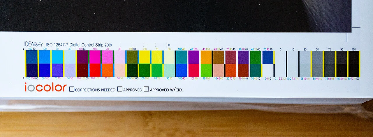
The spectrophotometer scans these color bars as the pages come off the printer, measuring them to ensure color consistency page to page. If any drift in color is measured, the printer is stopped and the cause of the color drift is identified and corrected.
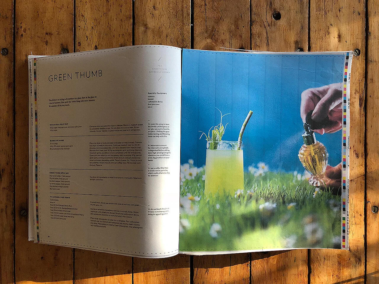
Once the proofs are generated, they are shipped to Sarah and I, where we visually inspect every page to ensure it looks like what we see on our monitors. This proofing process is what we’ve been working on for the past few weeks.
Once we’ve approved the proofs and said “Yes, these images look like what we expect,” they are shipped to the printing press in China. When it comes time for our book to be printed in earnest, the sheets of our book coming off this press will also have color target bars printed on their edges. The press itself has onboard spectrophotometers that measures each sheet for color drift. The press is a closed loop system, which means that it can rebalance ink density as needed to maintain color consistency over the duration of the print run. This ultimately ensures that all 30,000 books we will create match each other within a very small tolerance, and ideally also match what Sarah and I see on our monitors here in Chicago.
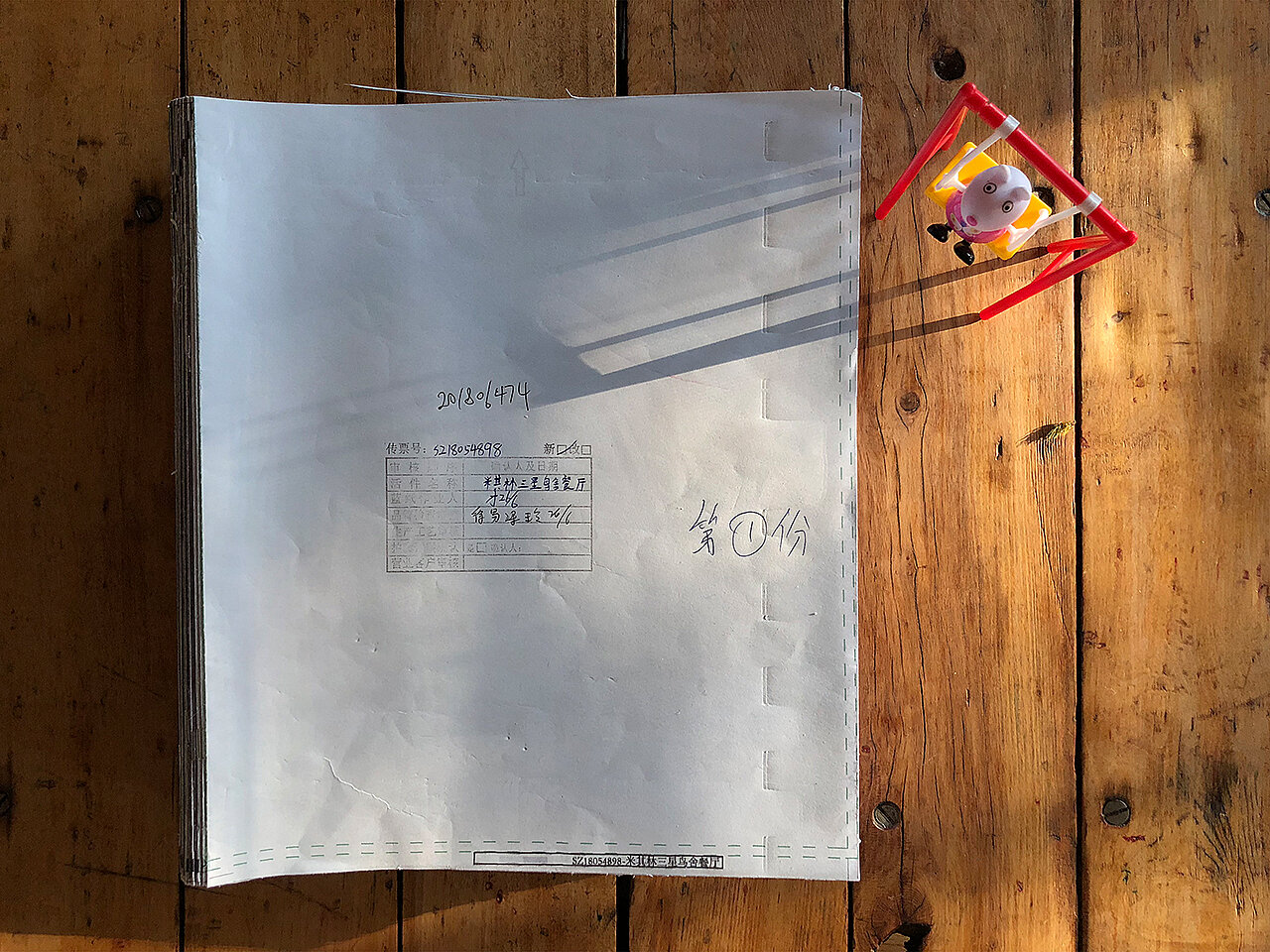
Right now, we’re at the point of this process where we’ve approved digital color proofs from iocolor, and these proofs have been shipped to our printer in China. The printer has begun work setting up the press run for our book. The first step in their process is taking our individual pages and imposing them on the large sheets of paper we learned about several updates ago. To verify that this page imposition has happened correctly, the press prints another proof to send us to review. Because the thing that we’re checking here is simply whether the layout of the book remains as we designed it (i.e. that all the pages are in the right order, are oriented properly, are not being cropped oddly, etc.), the proofs for this step are often created at a very low quality. This version of the book is sometimes referred to as a “plotter proof” or an “ozalid proof”, depending on the printing technique used.
This proof represents the final opportunity that Sarah and I have to effect any changes we may want to make (we’re still trying to comb through the book at every turn to find and correct things like typos or other mistakes). We will spend the upcoming days doing this and passing any changes back to the printing press. Once we’ve put our pencils down on this, the press will begin the full print run of the book.
Until next time;
–a
* Oh boy, you really want to go deep on color calibration! Here we go:
The astute reader will note that there are thousands of different devices in the world that are used to display images: monitors, projectors, televisions, VR headsets, mobile devices, etc. Each of these devices is constructed differently, with different mechanisms for producing an image that you can view. As such, the “correct” way to reproduce Sarah’s blue color on her iMac monitor necessarily differs from the way, say, my 13-year-old Sony TV reproduces the same color (which is to say: the actual electronics in the iMac are operating in a different way than are the electronics in my TV). How, then, can all of these devices aligned such that they can display the same blue swatch identically?
The answer lies in the concept of a device profile. A device profile is sort of like a translator that says “This is how this particular device works, and so here are some instructions – specific to this device – for producing a particular color on it”. The international standard for expressing these instructions are ICC Profiles. If you’ve done any amount of work creating digital imagery, you’ve likely run into this slightly-inscrutable term at some point in your tenure. ICC profiles provide a translation for representing a color from a known color space on a particular input or output device.
What is a known color space? The international standard for this is the CIE 1931 Color System (sometimes you’ll see this synonymously referred to as CIE LAB or CIE XYZ). This concept has for years remained opaque to me until very recently, when my good friend Erik (who is an extremely talented professional image inspector in New Zealand) shared this very interesting and understandable article explaining CIE 1931 with me. Paraphrased simply, CIE 1931 can be thought of as a centralized, internationally-recognized master language of the perceivable color spectrum, and ICC Profiles can convert color values to and from this language on the behalf of whatever devices they are describing.
Note that ICC Profiles are the mechanism by which color values are translated not only from CIE, but also to it. While Sarah chose her blue based on viewing her monitor (which has its own ICC Display Profile, to describe how to translate her blue to be properly displayed on her calibrated screen), our book is also filled with photography. The color my camera captures also needs to be converted into this master CIE space, and so my camera similarly has a device profile for this purpose. The same is true for any color acquisition device, such as film or flatbed scanners, webcams, etc.
Learning about this helps me understand why some photographers create profiles specifically matched to each of their cameras (and, in fact, to each lens for each of their cameras), to ensure accuracy in their own color pipeline. Because I’m learning this as I go, I have not taken such measures, and so there will undoubtedly be a (hopefully small) amount of inaccuracy in the color pipeline Sarah and I have built with iocolor as a result. This helps underscore the value of proofing our book repeatedly as we go: just as with the recipes, we have to accept some amount of tolerance for the fact that the images coming off the press may not match our monitors exactly, but we want to ensure they nevertheless look good.