
The Game, Pt. II
Hi friends;

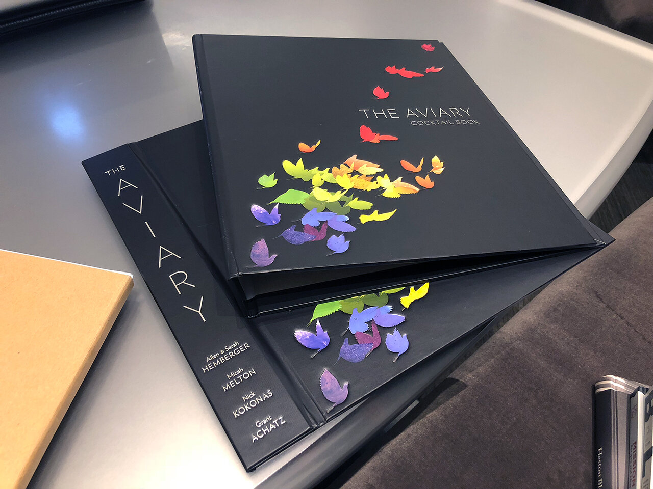
In the time since our last update, our book has been printed. A few days ago, the final moment of approval arrived at our studio in the form of what the industry colloquially refers to as "F&G's" – short for "folded and gathered signatures". A sample of each printed sheet in our book is folded and trimmed as exemplified in this short video. The resulting signatures are then gathered together in the order they will appear in the book.

If we examine the rear spines of each signature, we can see a small bar printed along the edges; these allow the binder to confirm at a glance that all signatures are in the correct order. These marks will eventually be covered by the outer spine of the book:

These F&Gs are the first time Sarah and I are seeing our book in its final, “for-realsies” form: printed on the paper stock we’ve chosen, with full-resolution images, under the tight color guidelines we’ve sought to adhere to throughout the process, with all varnish and metallic ink passes applied. The point of this final approval is to ensure that nothing has gone amiss, that the pages are ready to be sewn together and the hardcover (referred to as the “case”) applied.
Ideally, we should find zero errors in our F&Gs, but unfortunately, there are a few things that weren’t quite right. Here are some examples:

The foam on top of this cocktail contains a tricky transition of beige tones that sit right at the edge of the Magenta and Yellow color gamuts. We can see here that the press struggled to reproduce these subtle tones faithfully, producing instead a harsh edge with magenta “fringing” that looks obviously broken and incorrect.

Here’s another example: the shadows in the above image (seen most predominantly on the forefinger and in the frozen ginger snow mixture on the left) are clipping in a harsh way. We’re unsure what’s causing this – the anomaly is not present in any of our proof files, so we’ll need to track down the source of this problem with our printer.
There are some other errors we’ve discovered as well, but the matter of fixing these is more complex than one might assume, and here’s why. The printing press we use can generate 18,000 printed sheets per hour. At 30,000 books for our order, that’s less than 2 hours to print each set of sheets. The big cost is the setup and tuning of the press, not the actual time/paper/ink spent printing. Because of this, the printing plant actually prints all of our books before sending us these F&Gs to approve. I would have originally supposed that they would print one sheet of each set of pages, have us check them, and then print the full remainder. But this is horribly inefficient for the press; it ends up being more efficient for them to recycle and reprint sheets with errors. (!)
Because of this, Sarah and I are thoughtful about things we might like to fix. We need to be mindful of our paper supply, for example: fixing a single error requires another 30,000 sheets of paper to be sourced and printed. The two images above do not reside in the same signature, so that’s 60,000 sheets of paper that will be consumed to fix both of them. There is also the setup and re-print time involved – each fix we might like to impose will push out our delivery date further.
Balancing our desire for perfect quality, our abhorrence for waste, and our interest in getting books on their way to you makes this particular phase of error-spotting a rather emotional process for Sarah and me, and leads us into the slightly grey area of needing to prioritize what we feel is worth redoing vs. what we will correct for subsequent print runs in the future.
In any case, once this final stage of corrections has been completed, the books will be bound, loaded onto a large cargo ship, and sent on their way to us. We discussed the matter of receiving and storing these books in our last update, an underlying consequence of which is that we will soon begin incurring costs to house them all.
The timing of this is both fortuitous and difficult, for one major (and perhaps obvious) reason: the Christmas holidays. On the positive side, the climate will hopefully be favorable for us to sell our books expeditiously. On the other hand, the opportunity provided by the selling season is not lost on warehousing services. Amazon, for example, capitalizes on their sellers by raising their warehousing costs to three times their normal amount during the holiday months. If we choose to make our book available on Amazon for the Christmas season, it’s strongly in our interest to minimize the time our books languish in their warehousing system.
And so it is here that we intersect with something that I’ve grown to find completely fascinating over the past few months: advertising.
First, let me provide some context: both Sarah and I completely loathe advertising. I have no fewer than three ad-blockers installed in each web browser I use. We jumped ship on cable TV over a decade ago because we hate commercials. I have a complete distaste for the seemingly-inescapable ad-driven online ecosystem bequeathed to us by Facebook, Instagram, Google, and the like – I find the thought of having my online movements constantly monitored an unwelcome and uninvited intrusion on my privacy. I generally find most advertising crass, obnoxious, and tasteless, and am irritated at the insistence on appealing to the lowest common denominator that most advertisers seem intent on doing.
All of this is to say: making ads initially struck me as the most repugnant way I could possibly spend my time. But coming to an understanding of the various costs and schedules involved in dealing with this large order of books made clear to me the need to engage with the marketing aspect of this project. Sarah and I have to learn to dance with this devil; we have to learn to be good at something we initially despised.
Our toehold for coming to terms with this came in the form of advice from Nick. “We’ll just make a game of this,” he suggested cheerily. “Just because you think most advertising out there is terrible doesn’t mean you have to make advertising you think is terrible. What do you want to see?”
Turning adversity into a tailwind is something I’m totally fascinated with, and Nick’s comments fueled me with curiosity. This thing I completely hated suddenly became interesting to me. I started viewing ads with a ton of scrutiny. Why do I hate a certain ad that goes by on Facebook? What do I wish it was? What would I find compelling to see?
My first thought was “I like learning. I would want to see something that presents me with interesting information”. So I started rifling through the photos I’d taken for this book. This was the first ad I came up with:

This was originally meant to be a full 2-page spread in our recipe for “Fresno Chile Ice Cubes” (which is served in our Margarita). It’s actually a composite of about 10 individual photos layered together to form one seamless image. As the Aviary Cocktail Book grew, though, we unfortunately needed to edit out some stuff to keep the book from growing so large as to be structurally unsound (at its final size of 444 pages, it’s just barely under this limit).
I didn’t hate it. I like this image, and I liked the thought of offering a little “behind the scenes” information. I tried making another one:

We wanted to photograph this cocktail (“Monkey Tail”, p.230) with this beautiful sterling silver monkey straw, but the weight of the monkey kept causing the straw to twist the wrong way in our photo. So we built a small paddle out of blue painter’s tape and affixed it to the bottom of straw, which helped keep the monkey in place long enough for us to snag this photo of the drink.
Again, I liked it. It seemed like fun little trivia to offer, and hopefully provoked enough interest to cause someone to want to learn more (maybe?)
I decided to show these to Nick and ask his thoughts.
“So, here’s the thing with these,” he began after I explained what I was trying. “These ads assume that the viewer 1) knows what the Aviary is, 2) knows that we are making a book about cocktails, 3) knows that these images are from our book, 4) is interested in some behind-the-scenes information about how we made the book, but 5) hasn’t yet decided to buy this book.”
“I think it’s fine to try using this ad,” he continued. “We should, in fact, just to see what happens. But I suspect that your audience for these is relatively small. The thing to keep in mind here is that there are way, way more people in the world who have never heard of the Aviary than people who have. So part of this game is figuring out how to be clear and concise about what this is.”
It has been this last bit that I’ve found the most fascinating and insightful. It’s caused me to be very mindful of how I interact with ads on services like Facebook or Instagram. I notice that if I scroll by something and realize it’s an ad, I usually just flick right by it in less than a second. I suspect this isn’t uncommon, which helps me realize how short of a story we have to tell in that split-second. This stands in stark contrast to the world from which Sarah and I come, in which we usually have a few leisurely hours to tell a story.
Sarah and I went back to the drawing board with all of this in mind. The distaste we had for advertising started giving way to conversations in which we tried to imagine conveying our work in a split second to someone who had no context for any of this. Having no real experience creating work like this, we fell back to the things we knew best as a starting point.
Both of us have a strong fondness for punchy, vivid colors; my taste for this is reflected heavily in the photography of this book. I wondered about photographing the book itself using this same style, with a brightly-colored background. But we don’t actually have a physical copy of the book yet, so I tried making a computer-generated one instead.

In addition to a bit of extra visual interest, this suddenly adds some clarity: this image we’re looking at is one of many in a book. But what kind of book? It’s not clear that this is a cookbook, and it’s definitely not clear it’s about cocktails. As interesting as the image is, it’s working against the story I need to quickly tell about what we’re doing.
So I tried again:

The inclusion of some text here seeks to add more information: in that split-second of scrolling, I’m trying to convey to the viewer that what they’re looking at is a recipe, probably for some sort of beverage, and that the beverage is a bit unusual. Will they want to stop and learn a bit more?
Sarah is running in a different direction, one that plays to her strengths as an illustrator and animator. She originally had the thought that she wanted to try creating an animated illustration that highlighted The Office:

The above was her first version of this animation. We both love it, but after scrutinizing it for a while, we have some notes for ourselves about how this might be made more effective. We find The Office a lush, comfortable, and inviting environment to be in, so trying to tell that story was an obvious thought: the animation above spends much of its time building and then lingering on the Office environment itself. But dwelling on this aspect of things presupposes that someone else knows and likes this environment as well. To someone for whom this is wholly unfamiliar, there’s no establishing information to help give context to what this animation is about. Is it about a bar interior? Is it about a cocktail? We don’t discover until the very end that it’s apparently about a book (and even then, the “book” aspect is sort of lost…the word “book” is presented in the smallest typeface featured in the animation).
After talking about it, Sarah worked on a second version:

Here she’s modified her animation so that it both begins and ends with the most important information, and she conveys this information concisely (“This is about a book. Specifically, it’s about a recipe in a book, which implies it’s a cookbook”). She speeds through the buildout of the Office a bit more quickly, and ends her shot with the cocktail larger in frame. Beginning and ending with the same text and composition allows the animation to loop seamlessly, which makes it more fun to watch and also follows the visual parlance of social media platforms like Instagram or Twitter.
While we can continue honing these ideas and conjecturing about what might make a better ad, the only real way to know for sure is to try. Our mechanism for that is using the very online advertising machinery Sarah and I have tried so hard to eschew. The ecosystem provided by Google, Facebook/Instagram and others let us test our theories with an exactness that is simultaneously unsettling and fascinating. These tools allow an advertiser to understand which ads tend to attract the most interest and whether a given ad eventually translates into a sale. This differs dramatically from something like a billboard, a radio ad, or even a television commercial, for which there’s no real way to tightly tie the cost involved in creating the ad to income generated from it.
The whole experience of learning about this has indeed begun to feel like a game to Sarah and I. We find ourselves transitioning away from asking “What kind of ad would I like?” and towards questions like “What kind of ad would my mom find interesting? Or my uncle? Or that guy who lived up the hall from me in college?” These questions in turn lead us to ask “What bits of our book do we think would be most interesting to that person, and how can we make an ad to highlight those bits?” It’s become a fun exercise in empathy.
By this time next month, if all goes well, books should be en route to us from China. Once we have confirmation of this, we’ll begin the process of collecting shipping info from each of you and coordinating the delivery of your rewards.
Until next time;
–a