
Departure
Hi friends;
This update is presented in two parts; let's get to them.
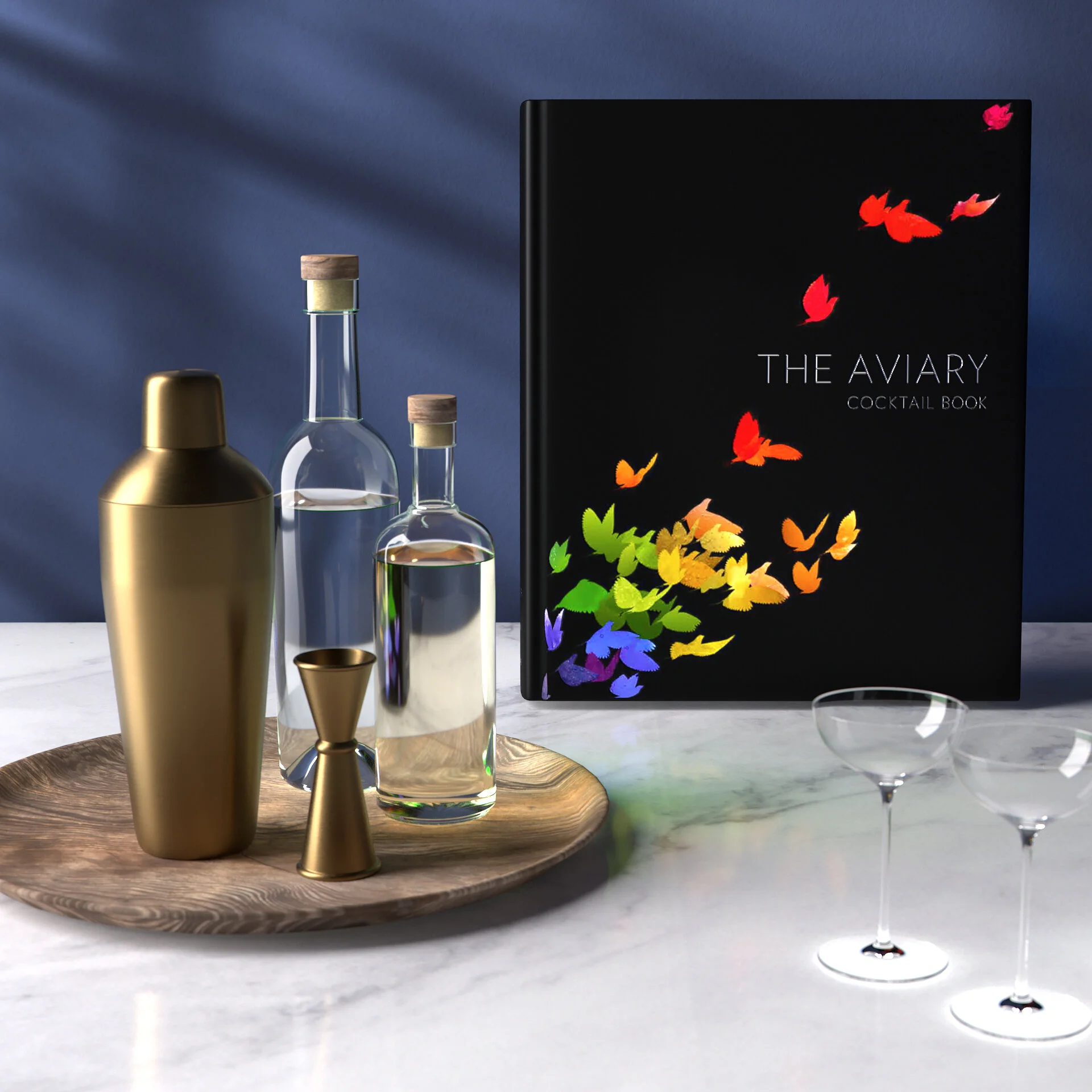
Part 1: The Book
After the pages of our book were printed last month, they were folded and sewn together using the binding techniques we've mentioned in past updates. The printer is currently in the process of fastening these sewn "book blocks" into their hardcovers, which ultimately yields complete, finished books.

After the book assembly itself, a bit more work needs to be done to create the custom case we've designed to house the Reserve Edition. These cases are individually handmade, and take a fair bit of extra time to produce.

Typically, a printer would bind all of the books and make all of the cases, then pack everything up, load everything into large shipping containers, and send the entire order to the various fulfillment warehouses to which they are destined. This would be the tidiest and simplest way to manage our shipment.
But our printer – knowing that we have an audience of supporters who have been following our progress with this project for quite a long time now – has offered an alternative shipping idea. They suggested that as they complete each book, they could begin filling two shipping containers – a 40-foot one and a 20-foot one – with enough copies of each edition to cover our early-supporter orders. These containers would then be sent to us as soon as they are filled, while the printer continues working on the rest of our order.
This obviously seemed like a pretty great idea to us, and so we've pressed forward with it. As of this writing, our two "early" containers have been filled.
The larger container holds our Standard Editions. This container will soon be loaded onto a cargo ship named Ever Eagle. We can collectively follow the ship's progress as it makes its way from China over to LA, where our books will pass through customs into the U.S.
In the smaller of the two containers are our Reserve Editions, which need to be individually signed by Chef Achatz, Nick, Micah, Sarah, and myself. For this, the five of us need to physically exist in the same space as the books in order to sign them. This leaves us with an interesting choice: we could pay the cost of bringing the container directly here to Chicago, or we could collectively fly to the warehouse that will house the books to do this signing work.
It's cheaper for us to go to the books, but we were advised that our fulfillment warehouse wasn't set up for a bunch of people to spread out and sign books for several days. Instead, we need to bring the shipment to us. Because the route of this container differs from that of the larger, it resides on a different ship, the OOCL GENOA, which – as of this writing – left Hong Kong a few days ago and is on its way across the Atlantic.
We currently anticipate the arrival of both shipments sometime in mid- to late-October. Once they arrive, the containers will be unloaded, the books unpacked, and each will be individually-labeled and sent on its way to you.
Part 2: The Game Theories
While I recognize that the topic of marketing leads us pretty far afield from cocktails or bookmaking, I've found the process (which we've detailed in our recent updates) so interesting that I feel compelled to share a bit more about it. When we last spoke, I'd mentioned that Sarah and I had begun work on a handful of ads to try running on social media platforms. For our first experimental run at this, we created a handful of ads designed to test a few different ideas.
Here's one of the first I made. The image itself is a closeup photograph of some raspberry ice marbles, which I felt were pretty and unusual:

And here's one of Sarah's first, featuring some illustrations she made of some of The Aviary's cocktails:

Nick often suggests the use of some sort of motion, which he suspects can strongly add to the appeal of an ad. Sarah, taking note of some of the ads being shown to her in her own feed on Instagram (Allbirds being one example that strongly appeals to her sensibilities), decided to test Nick's theory by adding some subtle animation to her illustrations:

Here's another example Sarah built, again with a small amount of animation:

I wanted to try creating something with some motion as well, so I leaned on my own visual effects experience to make this:

Sarah suggested we might try one example featuring a very classic cocktail, so she made this one using an image of The Office's Old Fashioned:

We also made one other ad, but explaining it requires a little bit of backstory.
While walking around one morning, Sarah and I happened upon a paper store. "Let's check this place out," Sarah interrupted our conversation to pull me into the shop. Once inside, as we were strolling up and down the aisles, Sarah stopped me and asked "would it have occurred to you to stop in this place on your own?"
"Hm. Not really, unless you'd told me to come here specifically to pick something up for you."
"Why do you think that is?" she asked.
"I don't really know. Why?" I shrugged, unsure where she was going with this.
"Well, what's this place sell?"
I looked around. The shelves were filled with dozens upon dozens of pretty paper products: large, handmade sheets embedded with flowers, or stationery kits emblazoned with pastel filigree. The whole place was colorful and swirly. "It seems like the perfect place to gift shop for you" I smiled.
"Right. But you probably wouldn't have come in here to buy something nice for yourself, even though I could point out lots of things in here that I know you'd like. And look around in here," she gestured at the dozens of customers in the store. "It's mostly women. Something about the vibe of this place suggested to you when you walked in here that it's meant for women."
"I wonder if most of the ads we've made so far skew masculine," Sarah continued. "There are a lot of delicious recipes in this book that my sister would love, or that your sisters would enjoy. But they have sort of a different design sensibility than you, and the ads we've made probably wouldn't be interesting to them."
I found this observation forehead-slappingly insightful, and immediately begin wondering how I might craft an ad that might skew more feminine. I began thinking of my sisters, both of whom devote a lot of attention towards curating their homes to feel comfortable and beautiful, and so I wondered about creating an ad that leaned less-heavily on the flashy cocktail theatrics and more towards an imagined lifestyle for the owner of our book. Where might my sisters, for example, keep this book in their homes?:
Sarah wanted more time to develop her own ideas for this, but with the above ads we had enough of a variety that we felt comfortable beginning some tests.
But before we get to the spoilers, I'll invite the reader to scroll back through these again. Which ads are your favorites (if any)? Which would cause you to pause and read more carefully about what you're seeing?
So, the nitty gritty. We chose to run these ads on both Facebook and Instagram, using Facebook's advertising tools. Facebook allows us to suggest some basic descriptions of our desired audience. Because we wanted to completely avoid bias, we instructed Facebook to show these ads to people who had expressed an interest in cocktails in some way...but we also wanted to specifically exclude anyone who had "liked" any of the social media pages for The Aviary or any of the other Alinea Group restaurants. We wanted, effectively, to be speaking to complete strangers, without any inherent knowledge of us.
After specifying this audience, we allotted an equal budget for each ad, and ran them all for one week. By the end of this period, we had some interesting data to sift through. There are several metrics by which we can measure the relative success of each ad, but for simplicity we'll consider "engagement", which is jargon for some expression of interest on behalf of the viewer (so, in the case of Facebook, "liking" the ad, commenting on it, sharing it, etc.).
What we found surprised us. We felt that our strongest ad would be the fireball animation, followed possibly by the "lifestyle" bar scene and maybe the animated illustration. But all three of these ads were dramatically eclipsed by the "Playfully Delicious" one above. In fact, "Playfully Delicious" outperformed ALL of our ads by a large margin.
The second-strongest performer was the Old Fashioned, which was another surprise for us. Our choice to create this ad was almost as an afterthought, and it was intended to represent sort of our "control" case, because it differs so very little from most other cocktail branding we've seen elsewhere. We worried it would be too predictable for The Aviary.
And while the animated illustration did well, we were surprised to find that it performed almost 10 times better than its non-illustrated counterpart.
This left – as our poorest-performing ads – the ice marbles, the fireball, and (in dead last place) the "lifestyle" bar scene ad.
Facebook of course offers no suggestions or indications why our ads performed as they did. But trying to understand this is quite a bit of fun. While I suspected, for example, that the flashy theatrics of the fireball ad would make it a clear winner, we can now theorize that it performed poorly because – if someone has zero context of The Aviary or that this is a book about cocktails – it's not entirely obvious what's going on.
Conversely, we can posit that the "Playfully Delicious" ad performed well because it combined Nick's theory about including a little bit of fun-to-watch motion with something that's understandably edible. Similarly, the Old Fashioned likely performed well because of its recognizability. While Sarah and I feel that The Aviary itself differs quite a bit from other cocktail bars (and our book differs drastically from most cocktail books we've seen), highlighting these differences might be less effective to viewers who may be wholly unaware of The Aviary than establishing some fundamental similarities first.
Sarah and I have been surprised to see similarities in this creative process and the creative process of the Aviary (and even Alinea itself): regardless of how disorienting or surprising a given dish might be, the chefs are careful to always include some sort of "access point": a toehold of familiarity that invites you to explore further. Sometimes this can be a vaguely familiar flavor note, other times it might be using a visual presentation that seems familiar. It seems that both on the plate and in these ads, a note of understandability or recognition can help bolster the connection we're trying to make with people.
The fun part of all of this experimenting is that we can easily test our own theories by making, say, a few more ads in the style of "Playfully Delicious" and see if they consistently perform as well as the original. And I can gut-check my intuition about the fireball ad by swapping out the pages for something that's more understandable as a cocktail (I could, for example, just try using the Old Fashioned image instead). This entire process is – as I mentioned in our last update – a completely fascinating exercise in empathy that I find to be a lot of fun.